Skip to content
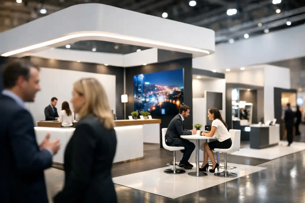
A busy show floor gives you only a few seconds to make your brand legible. That is why exhibition booth design is not just a creative task. It is a sales, operations, and production decision that affects foot traffic, lead quality, setup time, and how professionally your business shows up in person.
Most booths fail for simple reasons. The message is too broad, the graphics are too dense, the structure blocks movement, or the final output looks different from what the team approved on screen. Good results usually come from tighter planning. When the booth layout, printed visuals, structural elements, and installation work together, the space starts doing its job.
What good exhibition booth design actually needs to do
A booth has to perform under real event conditions. People are walking past quickly, lighting varies from hall to hall, neighboring exhibitors compete for attention, and your team still needs room to talk, demo, store materials, and move comfortably. A booth that looks impressive in a rendering can still underperform if it does not support these practical needs.
The first job is visibility. People should understand who you are and what you offer without stepping into the booth. The second is flow. Visitors need a clear path in, a reason to pause, and enough space to interact with staff or products. The third is brand consistency. Your booth should match the rest of your printed and physical assets, from brochures and flyers to backdrops, product boards, and corporate gifts.
This is where businesses often underestimate production. Exhibition work is rarely one item. It is usually a package of graphics, structure, counters, panels, mounted boards, banners, giveaway materials, apparel, and on-site setup requirements. If these pieces are sourced separately, consistency and timing become harder to control.
Start with the event objective, not the booth shape
Before selecting wall systems, counters, or display formats, define what the booth is supposed to achieve. A booth built for lead generation looks different from one built for product launch, retail sampling, distributor meetings, or corporate brand presence.
If your goal is high-volume traffic, the layout should stay open and the message should be short. If your goal is more qualified conversations, a partial meeting area may be more useful than extra graphic panels. If your team needs to display multiple SKUs, shelving and product labeling become part of the design, not an afterthought.
This is also where budget decisions become clearer. Spending more on structural features may not help if the real issue is poor message hierarchy. In other cases, a stronger fabrication approach is worth it because the booth needs to be reused across several shows. It depends on how often you exhibit, how large your footprint is, and whether the booth must adapt to different venues.
Exhibition booth design and visitor movement
Layout matters more than many buyers expect. A booth can have excellent printing and still feel difficult to enter. Corners, counters, product stands, and demo areas should guide movement instead of interrupting it.
Open-front booths usually perform well when the goal is accessibility. They reduce hesitation and let attendees scan the offer quickly. More enclosed concepts can work for premium brands or private consultations, but they need a stronger reason for visitors to step in.
Think in zones. There is usually an attraction zone at the edge, a conversation zone inside, and a support zone for storage or staff use. If all three are fighting for the same space, the booth gets congested. A clean layout often outperforms a crowded one, even when the booth size is modest.
Sightlines matter too. Your key brand message should sit where people can read it from a distance. Secondary content can support it once they move closer. Many booths reverse this and place too much copy at the top, where nobody will stop long enough to read it.
Graphics should be read in layers
Large-format exhibition graphics are not brochure pages. They need to communicate in layers. At a distance, visitors should see the brand name and a simple statement of what you do. From mid-range, they should catch product categories, differentiators, or campaign visuals. Up close, they can engage with details through printed boards, handouts, or one-to-one discussion.
The biggest mistake is trying to say everything on the wall. Dense paragraphs, too many logos, or multiple competing messages reduce clarity. A shorter message with stronger hierarchy usually gets better response.
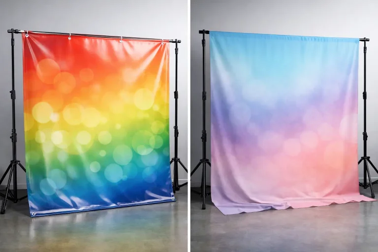
Print quality also has a direct effect on perception. Color consistency, sharp text, clean mounting, and proper finishing all shape how professional the booth looks under exhibition lighting. This is especially important for brands presenting premium products, technical services, or corporate solutions where presentation affects trust.
Materials and fabrication affect both appearance and execution
Booth design decisions are not only visual. Material choice changes transport, durability, setup complexity, and the final finish. Foam board, PVC display panels, fabric backdrops, sticker applications, wood structures, and mounted signage all have different strengths.
Lightweight materials can reduce handling issues and speed up installation, but they may not suit every build. More solid fabricated elements often improve presence and durability, especially for custom counters, shelving, or feature walls, though they can increase logistics and setup requirements. The right choice depends on whether the booth is one-time use, modular, or intended for repeat deployment.
This is where a production-focused supplier adds value. When design, print output, fabrication, and installation are aligned from the start, there are fewer surprises later. Dimensions, file preparation, finishes, and structural details can be resolved before the booth reaches the hall.
Don’t separate booth graphics from the rest of the event package
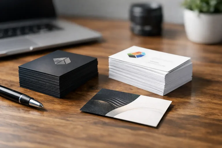
A booth rarely stands alone. Sales sheets, brochures, catalogs, name cards, stickers, redemption cards, apparel, packaging, and branded giveaways all contribute to the event experience. If these items feel disconnected from the booth, the brand presentation becomes fragmented.
Businesses get better results when exhibition materials are planned as one coordinated set. The booth draws attention, printed collateral supports conversations, and branded touchpoints help visitors remember the interaction after the event. This is especially useful for companies running launches, trade promotions, or category education where follow-up matters.
For teams managing tight timelines, consolidating these outputs under one vendor also simplifies execution. It reduces handoff issues between designers, printers, fabricators, and installers. That matters when show deadlines are fixed and there is little room for rework.
Common exhibition booth design problems to avoid
Some problems appear at almost every event. One is overdesign. Too many visual elements compete for attention and weaken the main message. Another is underplanning for staff behavior. If the team needs power access, storage, sample handling space, or a screen mount, the booth should support that from day one.
Another frequent issue is poor scaling. A design may look balanced on a laptop but feel oversized or undersized in the actual space. This is why production checks matter. Graphic proportions, font readability, panel joins, and viewing distance should all be reviewed against the real booth dimensions.
Then there is the setup problem. A booth that looks ambitious on paper can become stressful on site if components are hard to assemble, graphics are mislabeled, or installation sequencing has not been thought through. Reliable execution is part of design quality.
What buyers should prepare before requesting a booth quote
The quote process moves faster when the basic inputs are clear. Booth size, venue rules, event dates, target use case, and whether the structure is custom or modular all shape the approach. It also helps to define what must be included beyond the booth itself, such as banners, mounted boards, product displays, handouts, or installation support.
If you already have brand guidelines, campaign visuals, or past booth references, those should be shared early. If not, a practical brief still helps. State what products or services need emphasis, how many staff will be on site, and what the visitor should do after entering the space.
For businesses exhibiting in Singapore, local venue access, setup timing, and contractor coordination can affect the production schedule. This is one reason many buyers prefer a partner that can handle print, fabrication, and installation together rather than piecing the job across multiple suppliers.
A strong booth does not need to be oversized or complicated. It needs to be clear, well produced, and built around what your team is trying to achieve at the event. When exhibition booth design is treated as part of your full execution plan, the booth works harder, setup gets easier, and your brand shows up with fewer weak points. If you are planning your next event, start with what the space needs to do, then build the graphics, structure, and print package around that reality.