Skip to content
A crowded show floor gives you only a few seconds to make the right impression. The best exhibition booth branding elements are the ones that help people recognize your brand fast, understand what you offer, and feel confident enough to stop and talk.
That sounds simple, but booth branding often gets diluted by too many messages, weak print quality, poor layout choices, or display pieces that look fine in isolation but do not work together on-site. A good booth is not just attractive. It has to function under event conditions, support staff conversations, and stay consistent across every visible surface.
What makes the best exhibition booth branding elements work
The strongest booth branding elements do three jobs at once. They build visibility from a distance, communicate value at mid-range, and support detail once a visitor steps in. If one of those layers is missing, the booth usually underperforms.
For example, a back wall with strong color and a clear logo may attract attention, but if the product message is vague, visitors keep walking. On the other hand, a booth packed with product details may be informative, yet still fail if nobody notices it from the aisle. Effective branding is a coordinated system, not a collection of printed parts.
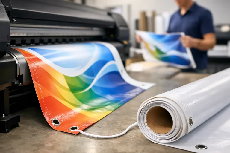
This is also where production decisions matter. Material choice, finishing, installation method, and viewing distance all affect whether branding looks premium or improvised. A design that works on a laptop screen can fail badly when scaled to a fabric wall, foam board header, or PVC counter wrap.
The best exhibition booth branding elements to prioritize
1. A clear, high-positioned brand sign
Your brand sign is usually the first thing attendees register. It needs to be readable from a distance, placed high enough to stay visible over crowd movement, and sized for the hall environment.
This is not the place for a complicated tagline or dense graphic treatment. In most exhibition settings, clarity beats cleverness. A clean logo presentation with strong contrast performs better than a visually busy sign that forces people to interpret it.
If budget is limited, put more investment into the primary sign and less into decorative extras. A weak top-line identifier is hard to recover from, even with excellent brochures or product samples.
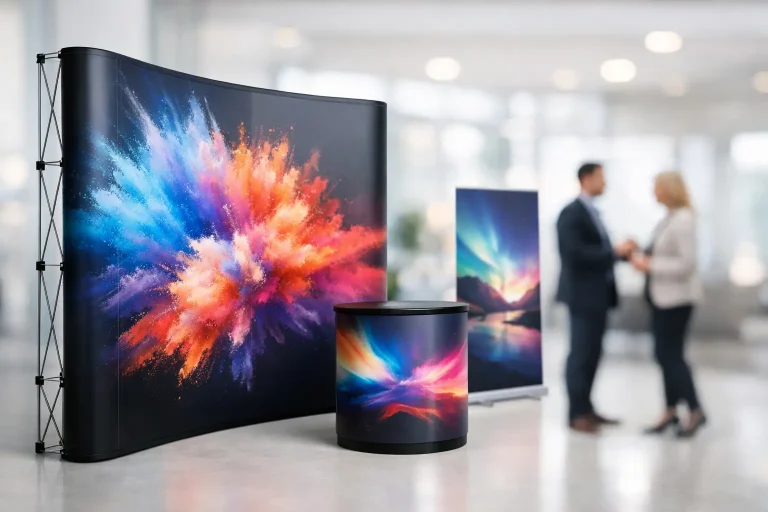
2. A back wall that communicates one message fast
The back wall is your main visual anchor. It should answer one question immediately: what does your business do for the visitor standing in front of it?
Many brands waste this space by trying to show everything. Too many service lines, too much text, too many product images, and the wall turns into background noise. A better approach is one core message, supported by one or two visual cues, then leave detailed selling points for handouts, screens, or staff conversation.
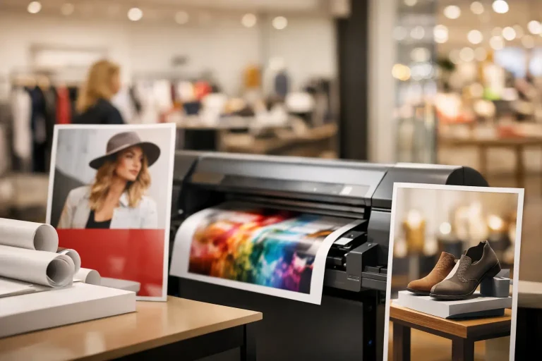
Large-format print quality matters here. Pixelated images, muddy color, and poor finishing reduce trust quickly, especially in B2B events where buyers are comparing suppliers side by side.
3. Branded counters and reception points
Counters do more than hold flyers. They are often the first physical touchpoint for visitors and the main visual surface at eye level when people approach the booth.
A branded counter should align with the back wall in color, typography, and message. It should also be practical. If the counter is cluttered with cables, boxes, personal items, and loose documents, branding loses impact no matter how well it was printed.
This is one of the most overlooked trade-offs in booth design. A minimal counter looks better, but a working team needs storage. The solution is not to skip the counter wrap. It is to build storage and workflow into the booth plan from the start.
4. Floor-standing banners that support traffic flow
Banners are useful when they serve a clear role. They can extend branding beyond the main wall, highlight a product category, or catch traffic from a side approach. They become a problem when they block sightlines or repeat information already shown elsewhere.
The best use of banners is directional and selective. A banner near the booth edge can attract visitors from an angle that the back wall misses. A banner inside the booth can reinforce a product line while staff speak with visitors. Placement matters as much as artwork.
For brands exhibiting in tighter footprints, retractable banners can still work well, but only if the graphics are disciplined. One message per banner is usually enough.
Best exhibition booth branding elements for stronger recall
5. Consistent brand colors across all printed surfaces
Color consistency sounds basic until you see how often it breaks down in exhibition production. Fabric, vinyl, foam board, acrylic, stickers, and paper can all reproduce color differently if they are not managed properly.
When the booth wall, counter wrap, brochures, and giveaway packaging all show slightly different brand tones, the space feels less organized. Visitors may not describe the issue out loud, but they notice the inconsistency.
This is where a production-led approach helps. Color matching across multiple substrates requires planning, proofing, and practical adjustment. The goal is not theoretical perfection. The goal is a booth that feels unified in real event lighting.
6. Product graphics that are readable at real viewing distance
A common mistake is designing product panels for close reading when most attendees first see them from six to fifteen feet away. Small text, fine-detail diagrams, and crowded icon sets do not perform well in an exhibition hall.
Good product graphics use hierarchy. Large headline first, short support statement second, deeper detail only where visitors are likely to stop. Think in layers. Someone walking past should understand the category. Someone pausing should understand the benefit. Someone entering should have enough material to start a conversation.
If your product is technical, resist the urge to place full specifications on the main wall. Those details are better handled in brochures, mounted sheets, or one-on-one discussion.
7. Printed takeaways that match the booth experience
Brochures, flyers, folders, product cards, and business cards still matter, especially in B2B environments where purchases happen after the event. But these materials should feel like an extension of the booth, not an afterthought.
If the booth looks premium and the handout feels generic, the brand experience drops. If the booth message focuses on one campaign and the brochure talks about unrelated services, the visitor leaves with a mixed impression.
Printed takeaways work best when they are selective. A short, relevant leave-behind is usually more effective than a thick brochure nobody reads. Match the format to the sales process. Some teams need quick product sheets. Others need presentation folders for follow-up meetings.
8. Apparel and staff identification that support the brand
Booth staff are part of the visual system. Branded shirts, jackets, name badges, and coordinated presentation standards make a booth look organized and ready.
This does not mean everyone needs to look overly formal. It depends on the industry, event level, and booth positioning. A tech supplier may prefer clean polo shirts. A luxury brand may need sharper finishing. A food brand may want a more approachable look. The key is consistency.
Apparel branding should support recognition without overpowering the interaction. Good staff presentation helps visitors quickly identify who to approach, especially during busy periods.
9. Structural and decorative elements that reinforce, not distract
Carpentry, shelving, display frames, lightboxes, sample zones, and feature walls can elevate a booth significantly. But only when they support the main brand objective.
Custom fabrication is useful when it improves product presentation, creates cleaner flow, or gives the brand a more credible physical presence. It is less useful when it adds visual complexity without helping visitors understand the offer.
This is where many booths overspend. They invest in structure before clarifying message. A simple booth with strong signage, consistent print execution, and well-placed branded surfaces often outperforms a more expensive booth with weak communication.
How to choose the right booth branding mix
Not every booth needs every element. A small startup pod and a full custom island booth have different requirements. The right mix depends on footprint, audience, event type, setup time, and what the booth is supposed to accomplish.
If your goal is lead generation, prioritize visibility, a strong message wall, and clean conversation space. If your goal is product display, invest more in graphic panels, sample presentation, and information hierarchy. If the event is image-driven, finishing quality and visual consistency carry more weight.
This is also why working with one production partner can save time and reduce mismatch across materials. When signage, printed handouts, branded counters, apparel, and installation planning are handled together, execution is usually cleaner and faster. For businesses preparing for trade shows in Singapore, that coordination can make the difference between a booth that looks assembled and one that feels professionally built.
Strong exhibition branding is rarely about adding more. It is about choosing the few elements that visitors will actually notice, then producing them well enough to hold up under real event pressure. If your booth can be understood in seconds and remembered after the show, you are already ahead of most of the floor.