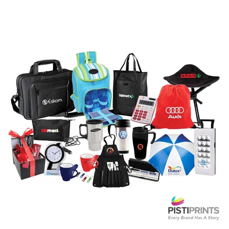
Colour is the first thing our eyes lock onto when we pick up a printed item. Before we read a word or notice a design detail, colour sets the mood and shapes our expectations. That reaction happens in a split second, which is why businesses pay close attention to how colour influences emotions, decisions, and long-term brand recall. This is the heart of colour psychology in marketing, and it plays a major role in everything from brochures to custom printed product packaging boxes to sticker printing in Singapore.
In this post, we will break down why colour matters so much in print, what different colours communicate, and how smart choices can strengthen your brand message.
Why Colour Matters In Print Marketing:
Colour reaches the brain faster than words or images because it taps into our instinctive processing. We don’t have to think to understand it. A bold shade can spark excitement, a soft tone can calm us, and a sharp contrast can pull our eyes toward a specific detail. This instant response is what gives colour its power in print marketing.
Colour sends a message right away, which means it plays a major role in shaping a person’s first impression of a brand. Brands that use deep blues often feel steady and dependable, while those that choose bright yellows tend to come across as energetic and approachable. These impressions form long before someone reads a tagline or product description, which makes colour a core part of brand identity, not just decoration.
Print relies heavily on colour to guide attention and build recognition. Think about business cards that need to stand out in a stack, flyers that compete for attention on a crowded noticeboard, packaging labels that must be readable at a glance, menus that highlight key items, or posters meant to draw people in from across a room. In every case, colour helps deliver the message faster and more clearly.
The Emotional Impact Of The Key Colours:
Colour carries emotion, meaning, and expectation long before a customer reads a single word. Each shade has its own psychological effect, shaping how people respond to your brand and products. Here is a quick breakdown of what the most common colours communicate.
1. Red
- Sparks urgency and excitement.
- Often used to trigger action or highlight promotions.
- Can also stimulate appetite, which is why it often appears in food branding
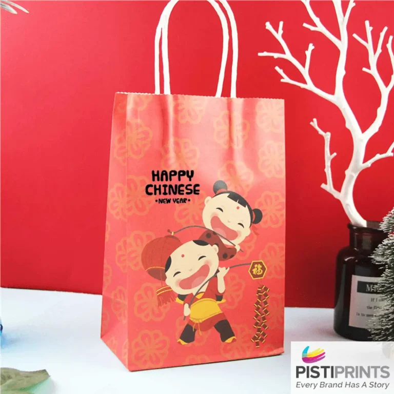
- In some cultures, red represents luck and celebration, which can influence how it’s used in festive packaging.
2. Blue
- Signals trust, calm, and steady reliability.
- Common in corporate, finance, and tech industries where stability matters.
- In some regions, blue is also tied to cleanliness and health, influencing how it appears in sticker label printing for wellness products.
3. Yellow
- Creates a sense of optimism and warmth.
- Great for catching attention, but best used in balance because strong yellows can overwhelm.
4. Green
- Represents growth, nature, and balance.
- Widely used in eco-friendly or wellness brands.
- Its association with sustainability makes it a popular choice for packaging and vinyl sticker printing in Singapore, targeting green-minded consumers.
5. Black
- Conveys luxury, power, and sophistication.
- Works well in high-end branding, minimal layouts, and bold contrast designs.
6. White
- Stands for clarity, purity, and simplicity.
- Creates clean layouts that let products or text stand out.
7. Orange and Purple
- Orange carries friendliness, energy, and approachability.
- Purple leans toward imagination, creativity, or premium positioning.
- Both colours can behave differently by industry: purple often suits beauty or luxury, while orange works well for active or youth-focused brands.
Colour has a strong influence on how quickly people decide to engage with a product. It can spark interest, create comfort, or raise curiosity in seconds. The right shades guide the eye toward key details like offers or calls to action. Every choice affects how a customer feels and responds.
Consistency across printed materials strengthens recognition. When a brand repeats the same colours, customers learn to spot it fast. This familiarity builds confidence and trust over time. It also helps create a clear identity that feels reliable. Strong colour consistency turns casual impressions into steady loyalty.
Common Mistakes To Avoid:
- Using too many colours
Adding too many colours can make your design look busy and unfocused. A crowded palette weakens your message and dilutes brand identity. Sticking to a small, intentional set of colours keeps your print clean and memorable. - Poor contrast that hurts readability
Low contrast between text and background makes content hard to read, especially from a distance. This can turn simple materials like menus, labels, and flyers into frustrating experiences. Strong contrast ensures your message is clear and easy to follow. - Forgetting about the material and finish
Paper type, coating, and texture can all change how colours appear. Glossy finishes often make colours pop, while matte tones can soften them. Testing on the actual material you plan to use helps you understand how the final piece will look. - Printing without checking CMYK conversions
Colours created in RGB on a screen do not always translate smoothly to CMYK for print. Without proper conversion, shades may shift or lose intensity. Reviewing CMYK values before printing helps keep colours accurate and consistent.
Stronger Colours, Stronger Branding With Pisti Prints:
A well-chosen colour palette reinforces your message by setting the right tone. Hence, it is important to test colours in print, since shades that look vibrant on a screen can appear different on paper. Reviewing printed samples helps you catch issues early and ensures the final result looks exactly as intended. Pisti Prints brings your colour vision to life with high precision colour printing and reliable colour matching. Below is how:
- High precision colour printing
Pisti Prints uses advanced equipment to deliver sharp, consistent colours across all materials, from labels to marketing collateral. - Support with colour matching and quality control
The team helps you match your brand colours accurately and checks every stage of production to keep colours steady across batches. - Custom print options for brand consistency
Whether you need small runs or large-scale production, Pisti Prints offers flexible print solutions to help your brand stay uniform across every printed touchpoint.
Conclusion:
Colour shapes first impressions, guides attention, and strengthens brand identity, which is why intentional colour choices matter in every printed piece. When used well, colour helps your message land faster and feel stronger. With the right printing partner, your colours stay sharp, consistent, and true to your brand. Reach out to Pisti Prints to explore our wide range of services.