Skip to content
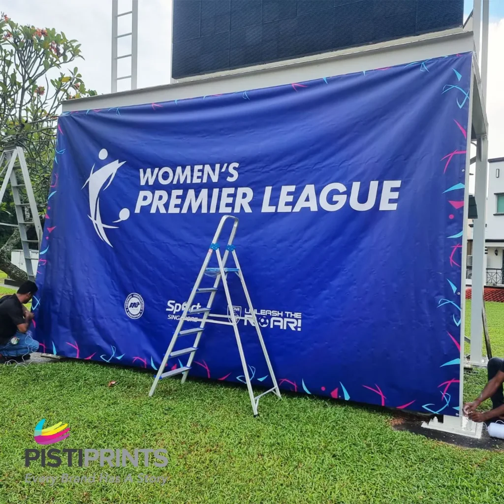
Let’s be real—most banners get ignored. They fade into the background, either too cluttered or too dull to make an impact. But a well-designed banner grabs attention, delivers a clear message fast, and drives action within a few seconds. That’s exactly what Pisti Prints helps businesses do. From sleek pull-up displays for trade shows to bold PVC signs for storefronts, our custom banner solutions are built to stand out in a crowd. Whether you’re promoting an event, a product launch, or a storewide sale, we know what works—and what doesn’t. In this post, we’re sharing their go-to tips for designing banners that actually get noticed. No jargon, no fluff—just smart design moves you can start using right away.
9 Smart Banner Design Tips To Help You Stand Out:
Creating a banner that gets noticed isn’t just about throwing your logo on a big surface—it’s about smart, strategic design. Whether you’re printing for a storefront, trade show, or outdoor promo, these tips will help your banners actually work for you.
1. Start with a Clear Objective
Before you open any design tool, ask yourself: What do I want this banner to achieve? Are you trying to get people to visit your booth? Promote a sale? Create brand awareness? Each purpose calls for a different design approach. A banner meant for product awareness might focus on strong branding, while a trade show banner needs to emphasize booth numbers and a call to action.
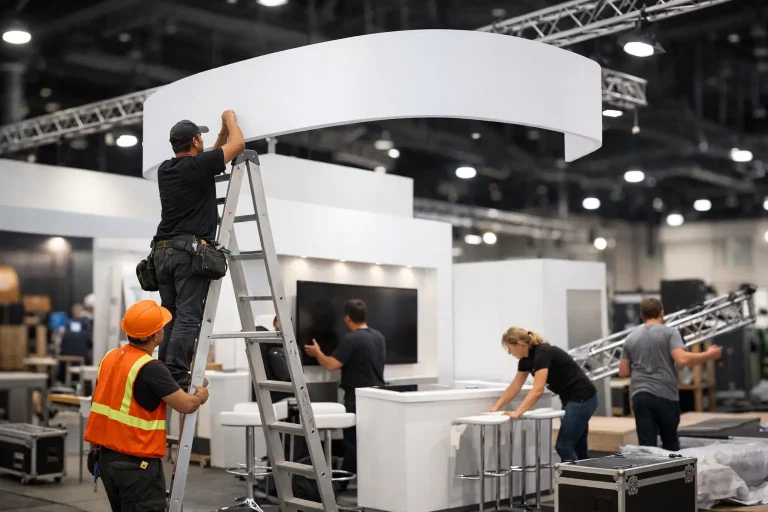
Our Exhibition Booth Printing & Event Setup Services can bring your event vision to life by aligning every printed element—from banners to standees—into one unified, goal-driven design, that delivers an intentional message.
2. Keep It Simple—and Readable from Afar
Your banner should tell its story in three seconds or less. That means cutting the clutter. Use short, powerful phrases and make sure your main headline is easy to read from at least 10 feet away. A good rule of thumb: every inch of text height equals 10 feet of readability. So, a 3-inch headline should be readable from 30 feet.
Use large fonts, clear spacing, and avoid unnecessary graphics or over-styled typography. We often encourage clients to design banners that communicate their message instantly, even to people passing by on foot or in a vehicle.
3. Use Colour with Purpose
Stick to a limited palette of 2 to 3 core colours that align with your brand. Make sure there’s a strong contrast between background and text to improve legibility, especially in bright outdoor settings. A white logo on a pastel background might look nice on screen, but it’ll disappear in real life. At events and exhibitions, consistent use of brand colours across all printed materials—banners, counters, backdrops—is crucial.
4. Design for Visual Hierarchy
Visual hierarchy is about guiding the viewer’s eye. Your headline should be the first thing people see, followed by a supporting message and then your call to action (CTA). Don’t put all elements at the same size—use different font weights, colours, and sizes to create flow.
Think of your banner as a conversation starter. You don’t lead with the fine print—you grab attention, give a quick reason to care, and then tell them what to do next. At a crowded event, this flow matters.
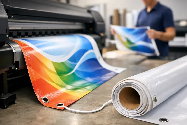
5. Choose High-Quality Visuals
Nothing kills your credibility faster than a blurry logo or pixelated photo. Try to use high-resolution images, 300 DPI at full size, and vector graphics whenever possible. Stretching a small image to fit a large banner results in distortion and fuzziness.
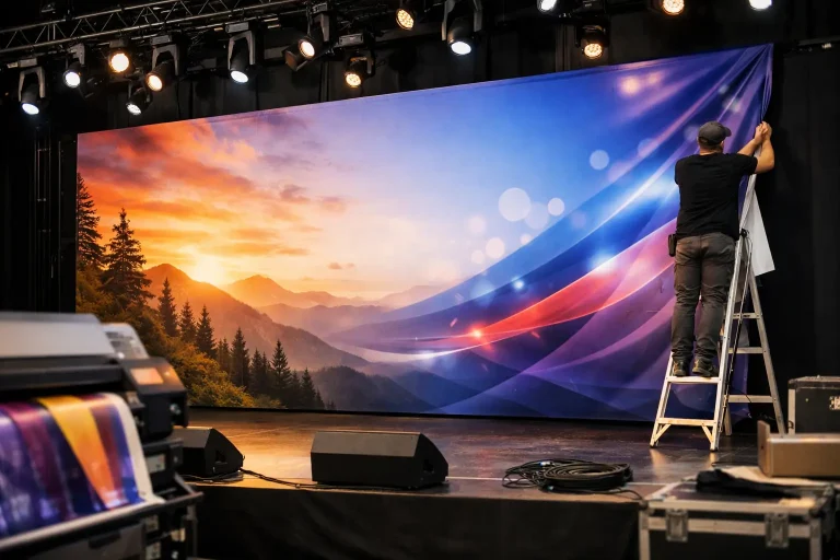
6. Size It Right for the Setting
Context matters. A banner that looks great behind a table at a pop-up shop won’t work the same way hanging above an exhibition booth. Determine the best banner size based on where it will be placed and how far away people will be when they see it.
For events, size and format should also match your booth layout. That’s why Pisti Prints offers full-scale solutions with backdrop banners, foam boards, counters, and standees all tailored to fit the booth space and layout. If you’re planning for event banner printing in Singapore, we are here to help you build an entire branded environment, not just isolated prints.
7. Include a Strong Call to Action (CTA)
Your banner should lead to an action—don’t leave people wondering what to do next. Keep the CTA short, bold, and direct. Use CTAs like “Shop Now”, “Scan For Details”, “Visit Booth D4”, etc. Place it prominently either at the bottom of the banner or in a highlighted shape like a button or contrast box.
8. Match Your Banner to the Event
Every event has a vibe—corporate, creative, casual, high-energy. Your banner should reflect your event’s vibe. A tech expo might call for clean, minimal graphics and structured messaging, while a product launch could be more colourful and bold.
9. Test It Before You Print It
Before you commit to the final print, do a small-scale test. Print a portion at the actual size to check for readability, contrast, and clarity. Even better, preview how it will appear in its actual setting with a mock-up or on-site simulation. This step often reveals small issues that can be fixed before they become costly. Ask someone unfamiliar with your brand to look at the design and tell you what they notice first. Their feedback will help you refine the hierarchy and messaging.
Summary:
A banner should do more than just fill space—it should command attention, deliver your message fast, and move people to act. With the right design strategy, you can turn a simple print into a powerful marketing tool. Whether it’s for a store opening, trade show, or major event, applying these tips will help you get results that stand out in the real world. At PistiPrints, we don’t just print banners—we help you make an impact. If you’re ready to level up your next campaign, get in touch with us for expert design, event setup, and high-quality banner printing